Commentary by Frank Schroth
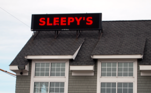
 We do not care for this Sleepy’s sign. Bulbs are starting to go out (see bottom of first “e”). It was initially approved as a Kennedy Carpet sign by a previous Board of Selectmen. When Sleepy’s assumed the space they retained the sign and received approval from the current board. Given the sign was already in place, there was not much the board could do. That sign is what it is. But now there is this.
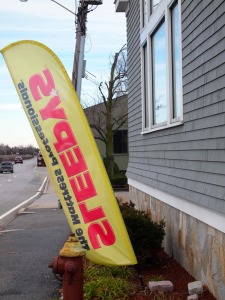
 We don’t like this one even more. It gives Granite Ave something of a Miracle Auto Mile quality. In our opinion, it’s not a good look.
Whether the current sign conforms to our bylaws is beyond our ability to determine. Regardless, it would be nice to see an alternative to this item which greets vistors coming north off the expressway.
3 comments for “Sleepy’s sign a bit of a snore”